Real signals · Real outcomes
Six tickers where the energy
told the story before price did.
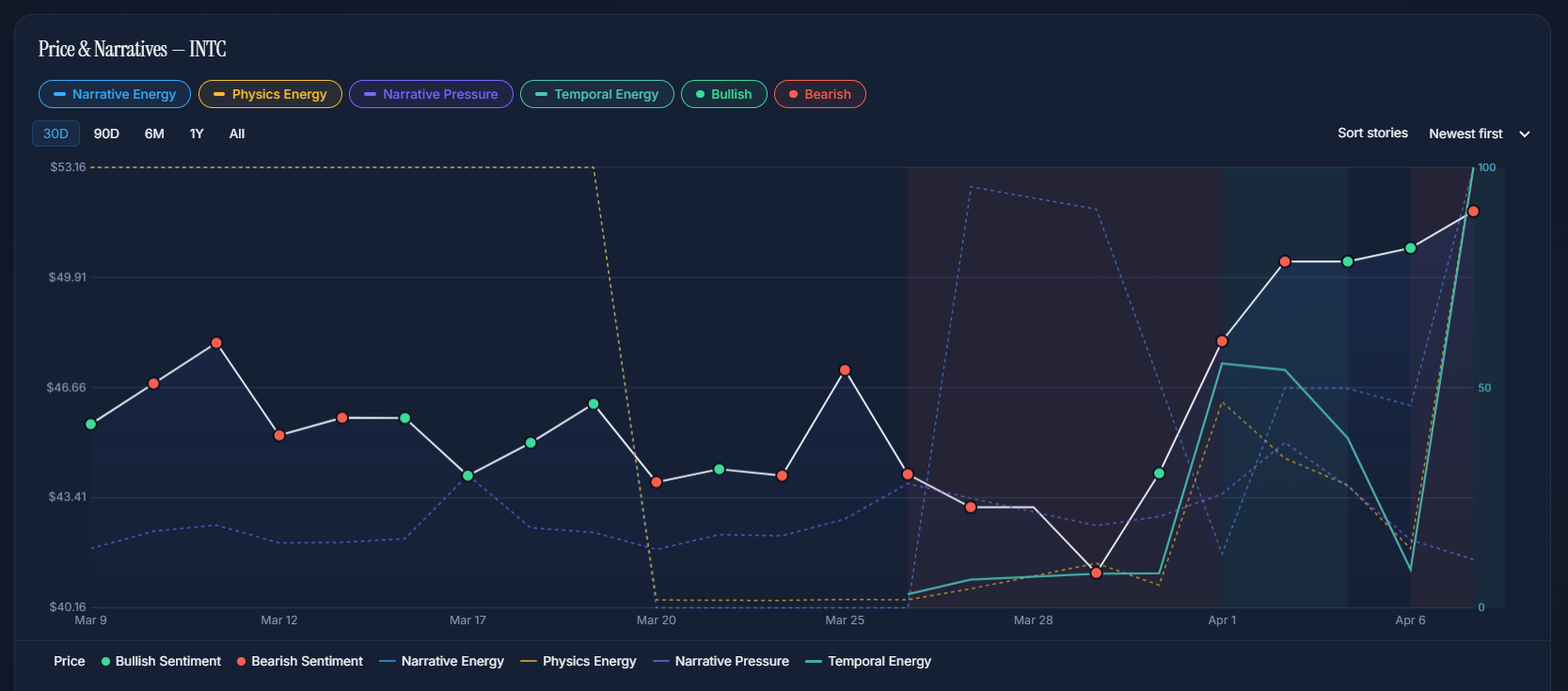
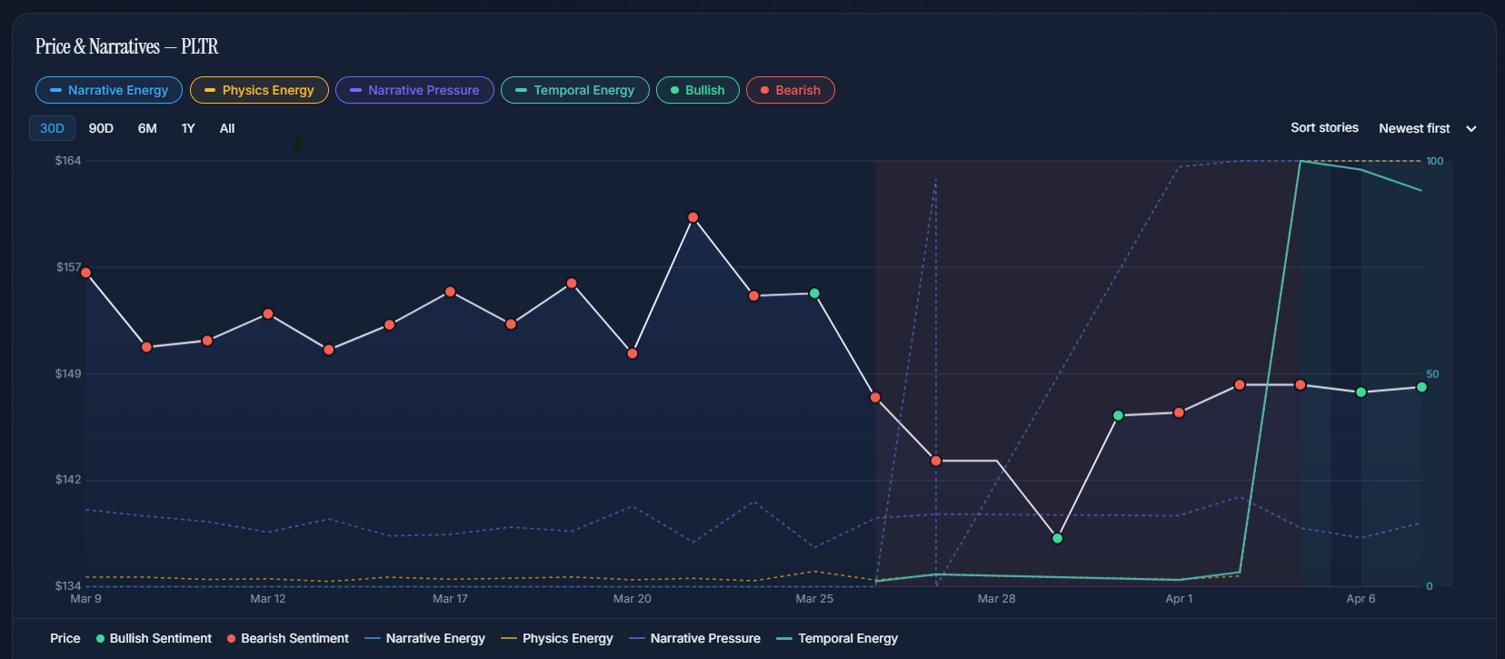
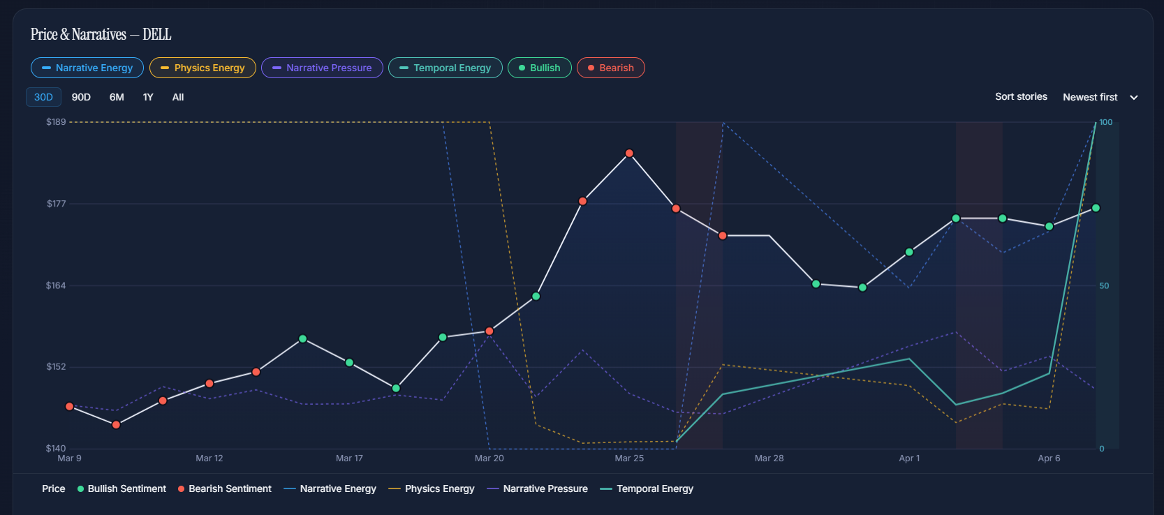
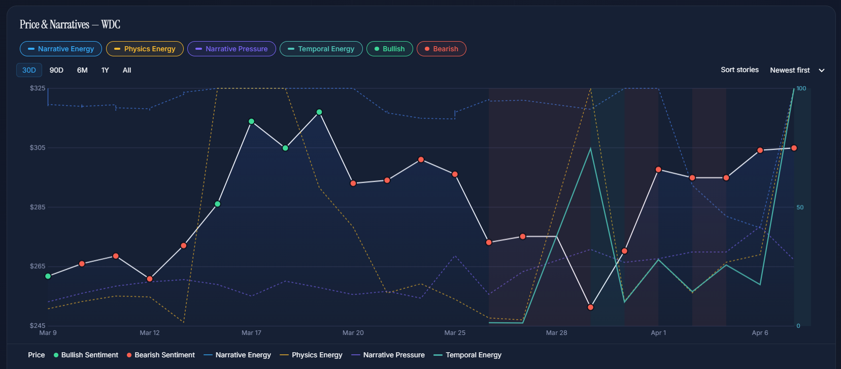
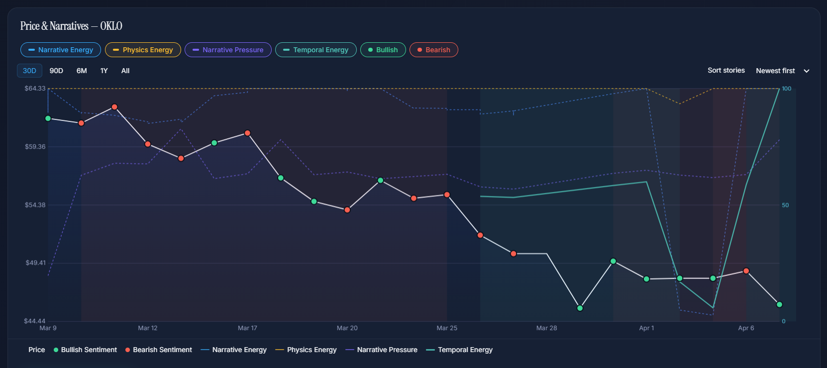
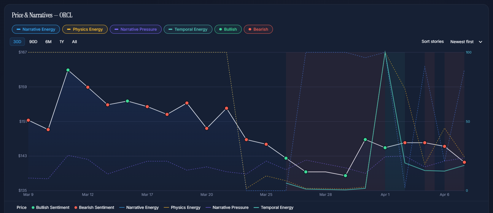
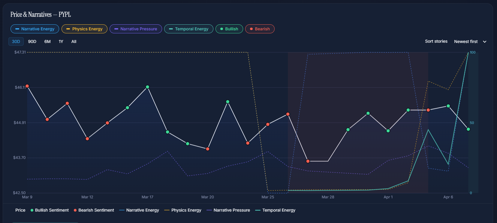
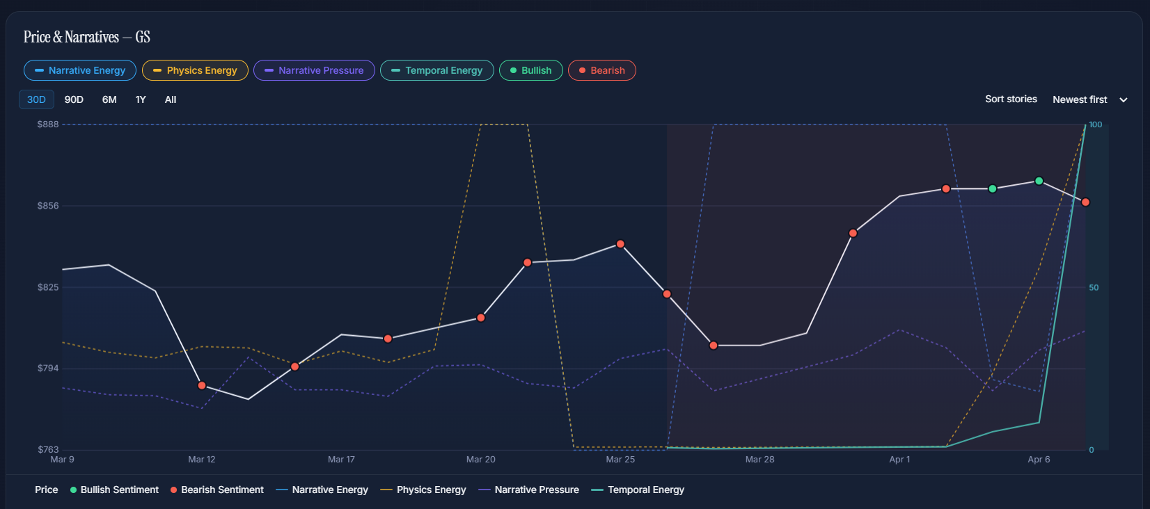
Each study shows a Signal Lab chart from March–April 2026. The narratives, energy levels, and verdicts are pulled directly from Market Prism's database. The price moves are real.
MP Materials was facing challenges with its vertical integration strategy due to operational issues at its Texas magnet facility. The media narrative remained bullish on rare earth demand, but Physics Energy had collapsed to 14% while Narrative Energy held at 100%.
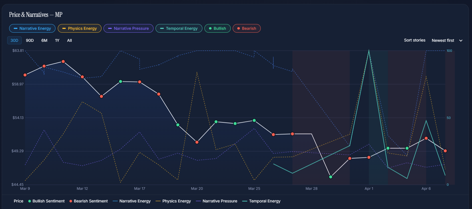
What the energy showed
Blue energy at 100% (story fully saturated) while yellow energy collapsed to 14.3%. Temporal Energy at 14.5% — near the critical threshold. The system classified this as Triple Threat: the most dangerous regime, where story volume, energy depletion, and source divergence all converge.
What happened to price
MP dropped from $63.73 to $49.68 over 5 weeks — a 22% decline. The sharpest single-day drop was −14.4% on March 30, exactly when Temporal Energy crossed below the critical zone. The narrative trap verdict proved correct.
Nike faced growing skepticism about its turnaround strategy under new leadership. The narrative about "unsuccessful strategy execution" was building while all energy lines converged at saturation levels with elevated Narrative Pressure at 25.9%.
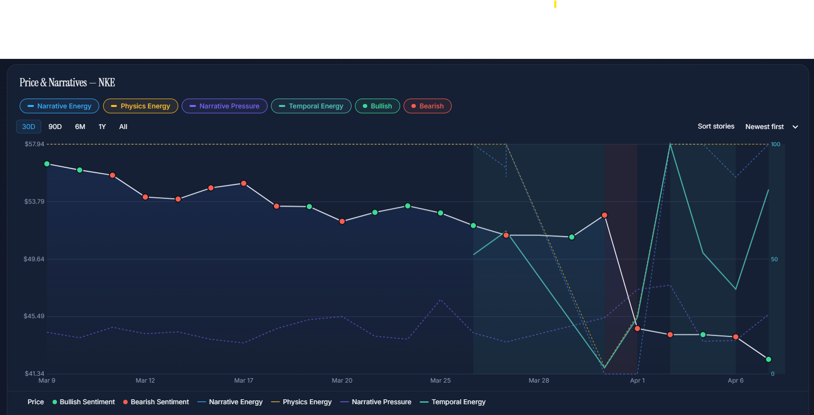
What the energy showed
Full saturation across all energy lines — blue, yellow, and temporal all near 100%. But Narrative Pressure (violet) was elevated at 25.9%, signaling coordinated coverage. When every source agrees and every energy line is maxed, there's only one direction left. The system flagged Coordinated Watch.
What happened to price
NKE declined steadily from $61 to $52, then cratered −15.5% in a single session on April 1 — falling to $44. Total decline: 28% in 5 weeks. The coordinated narrative collapsed all at once, exactly as the pressure signal predicted.
The media pushed a narrative that Snap could "increase fivefold" by cutting costs and pivoting to AI. Energy lines told a different story — saturation with a bearish direction. The system classified the regime as Regime Uncertainty, seeing through the optimistic headlines.
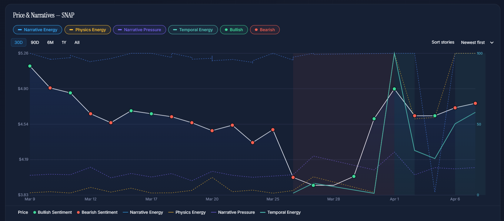
What the energy showed
All energy lines saturated at 100% with bearish regime direction. Temporal Energy at 58.4% — elevated but showing the first signs of decay. Narrative Pressure at 19.4%. The bullish "5x potential" narrative had no real energy behind it — just volume.
What happened to price
SNAP declined steadily from $5.26, with a −10.7% single-day drop on March 26 as the narrative broke. The stock bottomed near $3.92 before a brief dead-cat bounce. The "AI pivot" story exhausted itself exactly as the energy lines predicted.
The dominant narrative claimed NVDA's decline was "a buying opportunity" driven by continued AI chip demand and China market dynamics. But every energy metric told the opposite story — the narrative had completely run out of fuel.
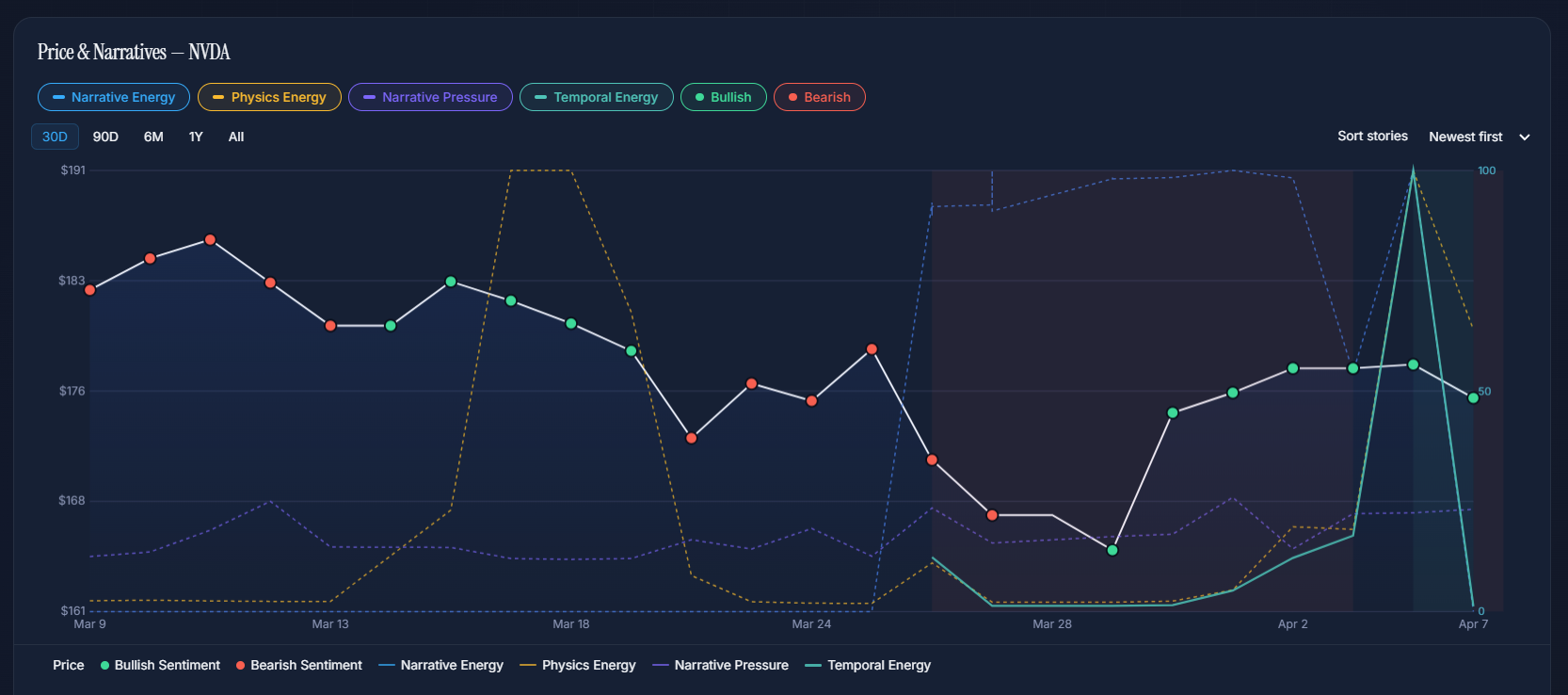
What the energy showed
Energy remaining: 0%. Temporal Energy: 1.2%. The narrative was completely exhausted. Blue energy at 50% (still some media coverage) but the underlying energy to sustain price had evaporated. The system classified this as Exhausted Narrative — the story simply couldn't push price any higher.
What happened to price
NVDA declined steadily from $182 to a low of $165 (−9.5% peak-to-trough) before partially recovering to $175. The "buying opportunity" narrative failed to sustain price because the energy behind it was already at zero. The chart shows the classic pattern: price follows energy, not headlines.
Trump Media was rumored to be merging with TAE Technologies in a $6 billion all-stock deal. The merger narrative generated headlines but the energy metrics revealed the story was already dying — temporal energy had collapsed to 4.6%.
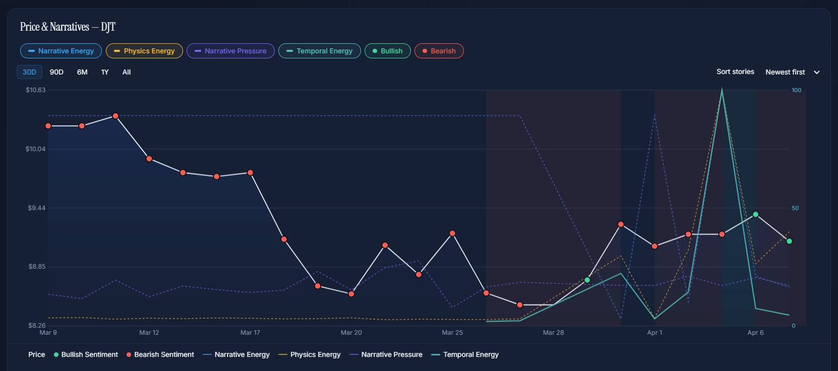
What the energy showed
Blue energy at 16.4% (low media volume), yellow energy at 39.9% (moderate substance), but Temporal Energy at just 4.6%. The merger narrative had no remaining energy to sustain price. Narrative Pressure at 17.1% — some coordination, but not enough to override the exhaustion signal.
What happened to price
DJT fell from $11.08 to $8.32 (−25% at the trough) before partially recovering to $9.38. The merger narrative couldn't sustain the stock because Temporal Energy was already depleted. This is a textbook case of exhausted narrative energy preceding a price decline.
The dominant narrative focused on Elon Musk's capital reallocation towards SpaceX and slowing EV growth. Energy signals showed a complex picture — mixed regime with bearish undertones. Temporal Energy was moderate but the narrative trap classification proved prescient.
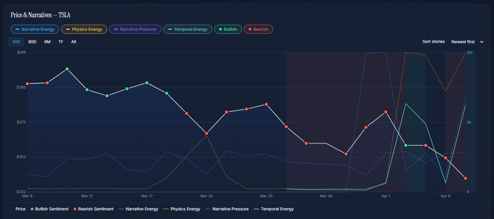
What the energy showed
Blue energy at 67.9% (significant but not maxed), yellow energy at 100% (high substance — the concerns were real), Temporal Energy at 62.2%. The system flagged Narrative Trap — despite moderate energy levels, the narrative about capital reallocation was creating a structural disconnect between story and price.
What happened to price
TSLA declined from $403 to $352 over the period — a 12.5% drop. The narrative trap classification was validated: the market was pricing in optimism while the energy signals showed the story couldn't sustain those levels. Notably, yellow energy at 100% confirmed the bearish concerns had real substance.